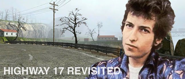
After finishing my list of favorite album covers, I wondered whether there are any diamonds in the rough when it comes to video game covers, which have over the years achieved a certain level of (admittedly deserved) notoriety. I did a bit of research and looked through my own pile for some traces of good graphic design. Lo and behold, I came upon enough quality covers to substantiate another of my beloved lists. Yay!
15. Shadow of the Colossus
It may be a product of "design by subtraction," but Shadow of the Colossus is pretty epic nonetheless. The majestic, looming presence of Colossus #1 on the game's cover conveys that pretty well.
14. The Legend of Zelda: Ocarina of Time
The Legend of Zelda is the world's greatest video game series. That's why they have the gold boxes. They deserve them.
13. Star Wars: Knights of the Old Republic
Woah! Composition good enough for a real Star Wars movie poster! And I don't even like Star Wars!
12. Half-Life 2
With his orange HEV suit, goatee, Weezer glasses, and trusty crowbar, how could Gordon Freeman not be seated in the pantheon of iconic video game protagonists? A close-up of the elusive theoretical physicist graces the cover of Half-Life 2's PC release, standing before a bloom-lit block of City 17.
11. Silent Hill 3
This close-up features freckles, which makes it better than Gordon's. Of course, the look of abject horror and exhaustion on Heather Mason's face, set against Silent Hill's rusty industrial nightmare world, certainly helps sell it to me.
10. Silent Hill 2
Silent Hill 2 is the scariest and most heartbreaking game I've ever played, so it only makes sense that its box art should instill similarly unpleasant emotions. A sideways shot of Angela's haunted face is filtered through sick green light and white noise, serving as a warning for the dark contents housed within.
9. Final Fantasy VII
There's probably a sizable deal of bias here, but Final Fantasy VII's box art puts me in a trance. Cloud Strife confronting the Shinra headquarters, Buster Sword in hand, is an image that may be forever imprinted in my brain.
8. Resident Evil 4 (PAL)
In what will soon become a theme of this list, North America consistently gets screwed over when it comes to video game box art. The American cover for Resident Evil 4, with floppy-haired Leon striking an embarrassing pose against an inexplicable purple sky, is quite simply lame. The PAL version, on the other hand, with its striking, stark design and blood-red monochromatic color scheme, actually manages to be legitimately creepy, in an attractive way.
7. Katamari Damacy
Oh, Japan. What would we do without you? Aside from Katamari Damacy's inherent, inescapable quirkiness, its cover art is really quite good; both an accurate representation of the weirdness within and an appealing image on its own.
6. The Legend of Zelda
I can only imagine how cool it must have been to be a kid in 1987, staring lovingly at the original Legend of Zelda's awesome gold cover before tearing into the contents and finding the "invaluable" map and playing manual. This is packaging done right.
5. Pikmin 2
SO. CHARMING. CAN'T. RESIST.
4. Final Fantasy VI (Japan)
I guess it sort of almost makes sense that America would get a different cover for Final Fantasy VI, seeing as how it was called Final Fantasy III over here, but did it have to be so damn inferior? Yoshitaka Amano's distinctive art style is on full display in the beautiful image that adorns FFVI's Super Famicom release. Man have we been deprived.
3. Secret of Mana
Presenting a real sense of place and scale, the gorgeous cover art for Square's SNES action-RPG features a high-quality title logo, stunning detail, and the eternally successful color harmony of red and green. Plus, those birds are really cool. I really like those birds.
2. Dune II: Battle for Arrakis
This is how all cover art should be. Economical. Respectable. Intriguing. Classy. Honestly, it's hard to believe this was designed exclusively for a video game case. The barren sands lead to a technologically advanced settlement (as the twin spires of black smoke would indicate) way over yonder, all under a cloudless blue sky. The letterbox look gives Dune II's box art a distinctly cinematic flair, adding to its already delicious graphic design.
1. Ico (PAL/Japan)
It's uncanny how much Fumito Ueda's tastes agree with my own. The Italian metaphysical and early surrealist painter Giorgio de Chirico may be my favorite painter of all time, and it's as if Ueda knows this. Ico's breathtaking European/Japanese cover is based on de Chirico's The Nostalgia of the Infinite, with its empty grounds, long shadows, and simple vertical structures. The cover we lowly Americans received was a shameful, dated CG embarrassment. I would love more than anything to slap some sense into the marketing idiot who deemed it a good idea to stray from Ueda's hand-painted masterpiece of a cover illustration. While Ico's box art uses no in-game assets, it is clearly representative of the whole experience: quiet, desolate, and lovely, with a sense of scale and space that makes the player feel like an ant scurrying about the confines of a fortress at the edge of the world. A+


Your college essay is going to be good..
ReplyDeleteI'm planning on including Ray's Challengewood in it.
ReplyDeleteRightly so..
ReplyDelete